Growth vs. Value Is Telling a Story 📉 The Chart Report

Chart of the Day
🏆 Today's Chart of the Day was shared by Ricardo Sarraf.
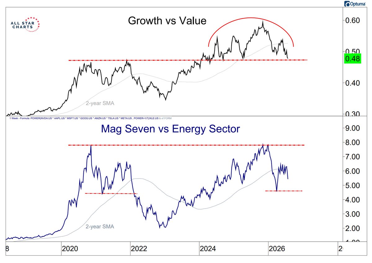
Growth relative to Value has carved out a potential multi-year top after pulling back to its prior cycle highs, a level that has acted as major long-term polarity.
Meanwhile, the Magnificent Seven relative to Energy failed to break out above its former highs and has recently fallen below its two-year simple moving average.
A continued breakdown in both of these risk-on ratios would represent a meaningful shift away from the market leadership that has defined this bull cycle.
The Takeaway: This bull market may be undergoing a significant change in character.
More Great Charts
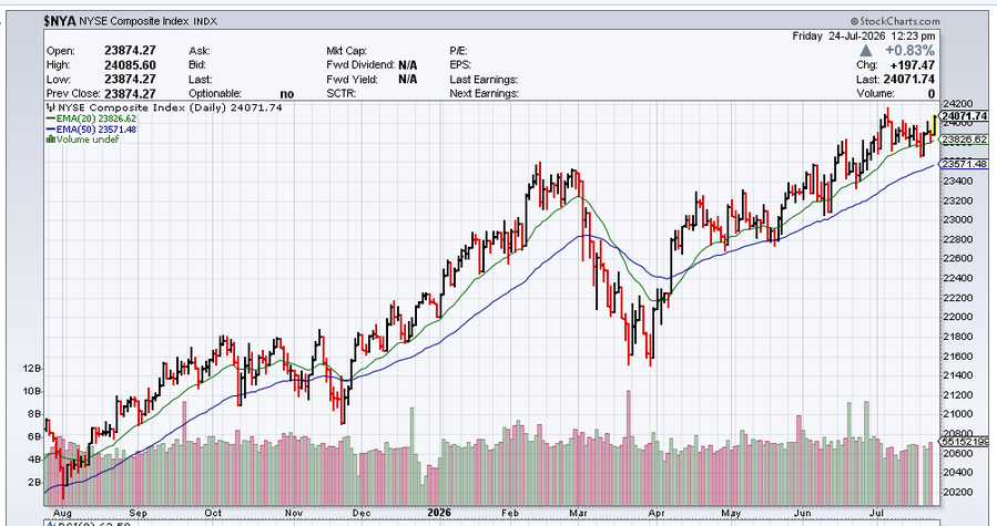
The NYSE Composite Index recorded a new all-time high weekly close.
See the full tweet from Mark Christopher.
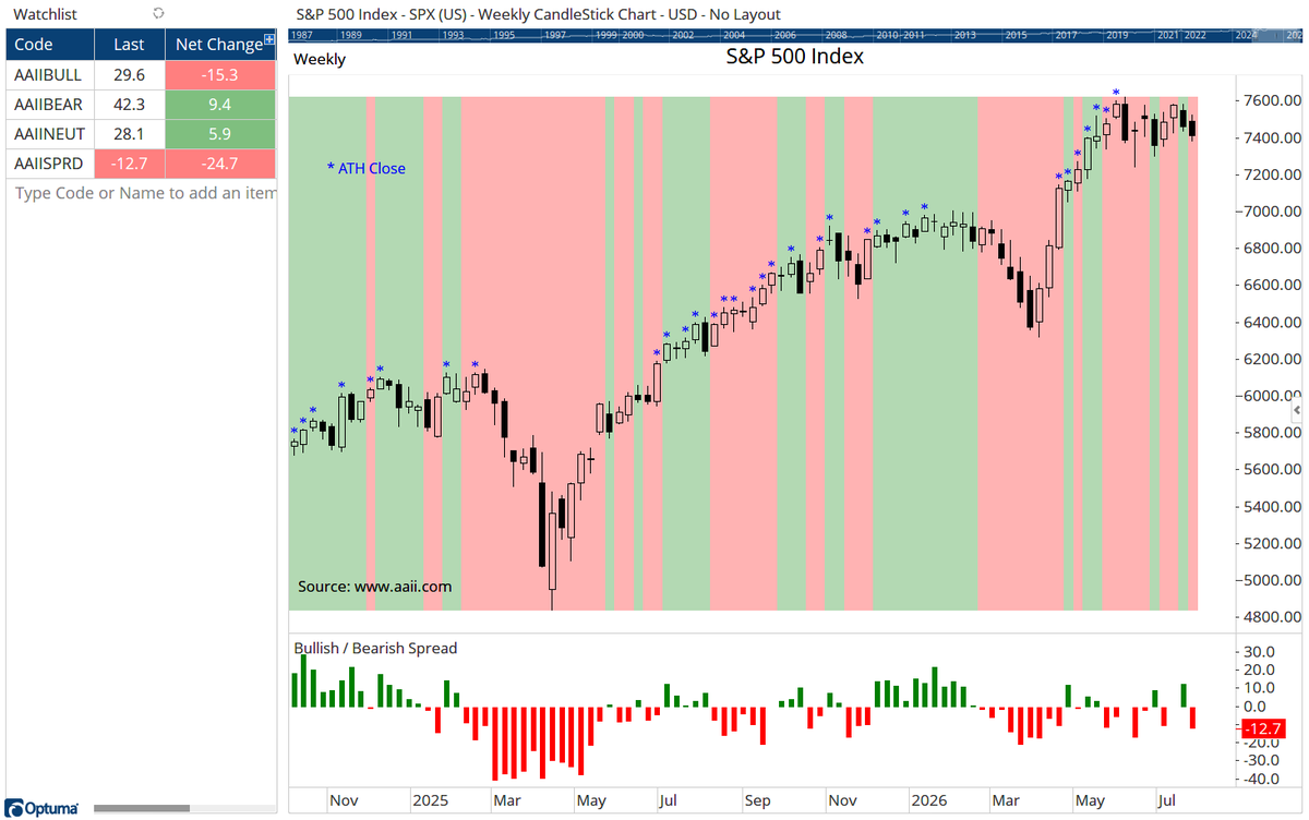
AAII sentiment turned negative following its largest weekly swing since February 2025, with bullish sentiment falling to its lowest level since last September.
Check out the whole post from Optuma.
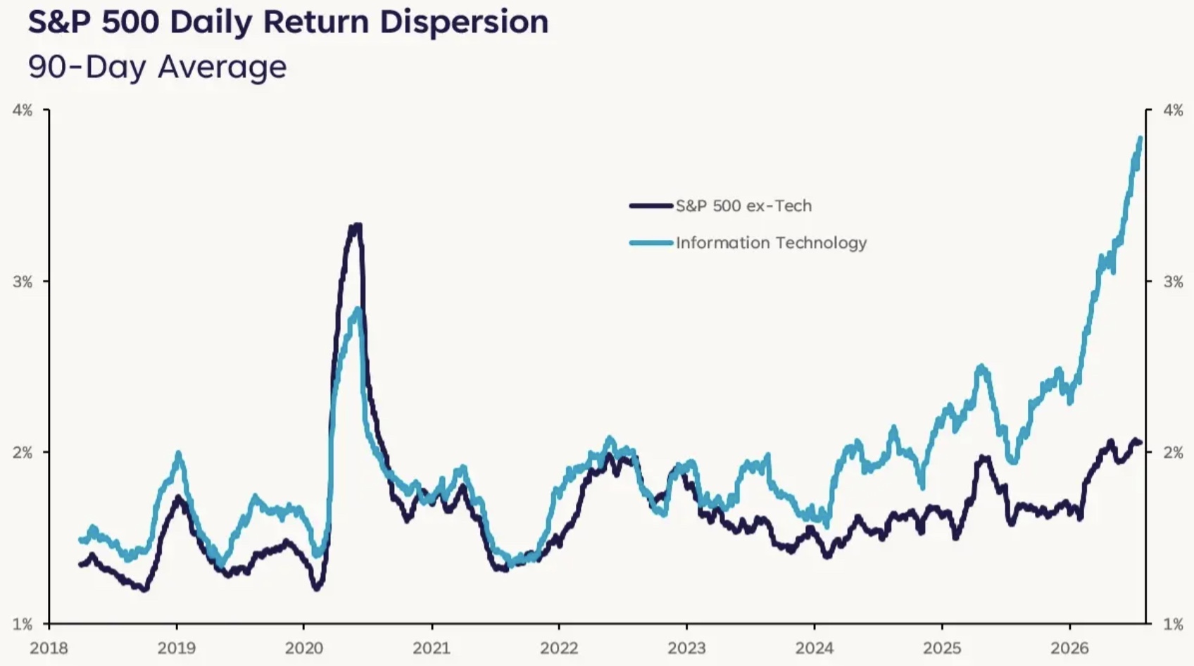
The return dispersion between Technology and non-Technology stocks has been extreme this year.
Explore the latest article from Liz Thomas.
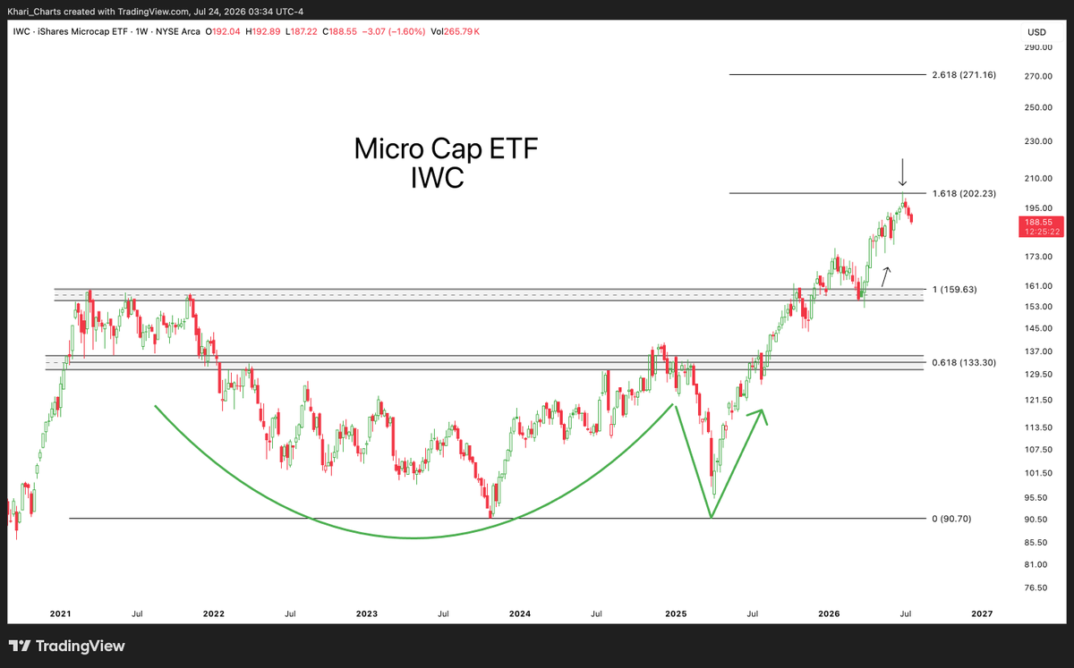
Micro-Caps have stalled at the 1.618 Fibonacci extension after a successful breakout and retest.
View the entire tweet from A.J. Gregor.
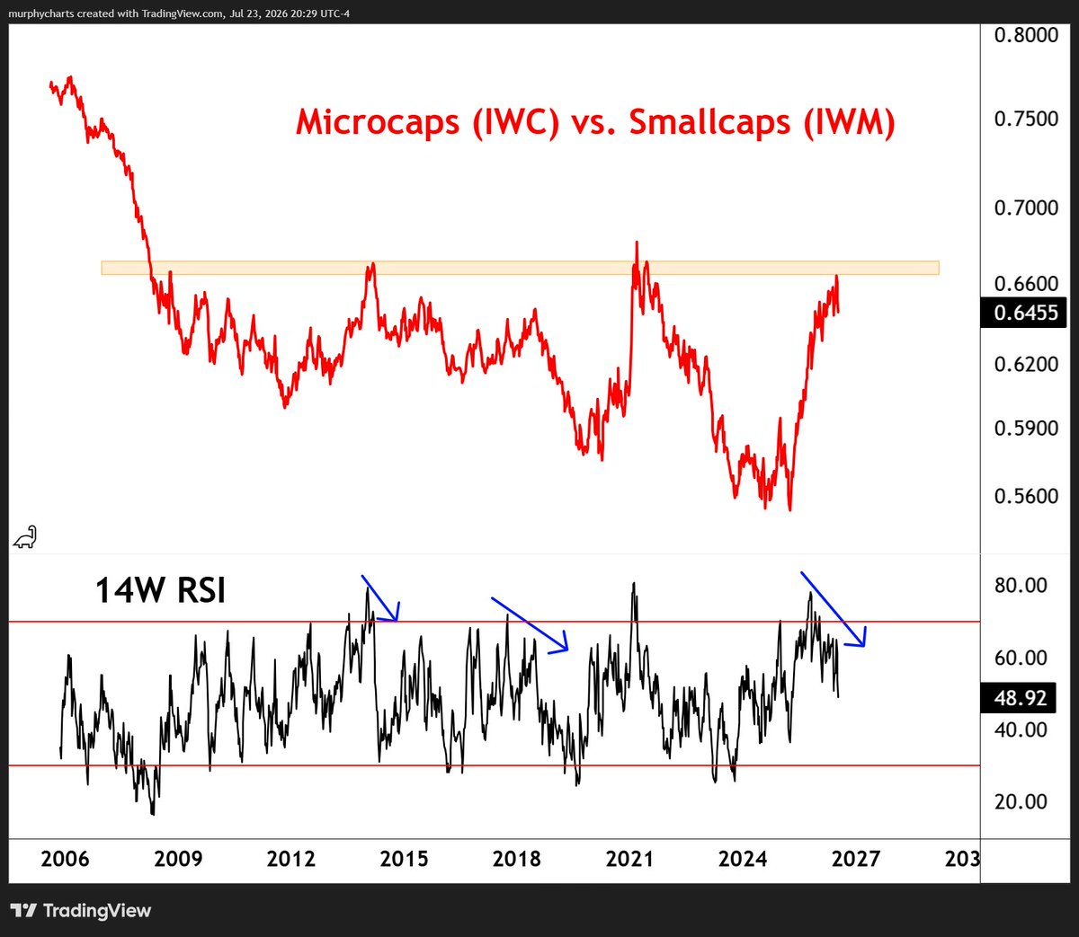
Micro-Caps relative to Small Caps are testing a two-decade resistance level with a bearish weekly RSI divergence.
Examine the full post from Shane Murphy.
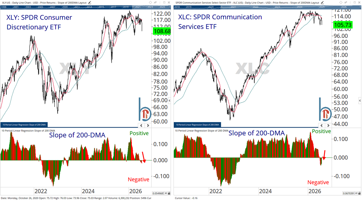
The 200-day moving average for both Consumer Discretionary (XLY) and Communication Services (XLC) has turned lower for the first time since the 2022 bear market.
See the whole tweet from Scott Brown.
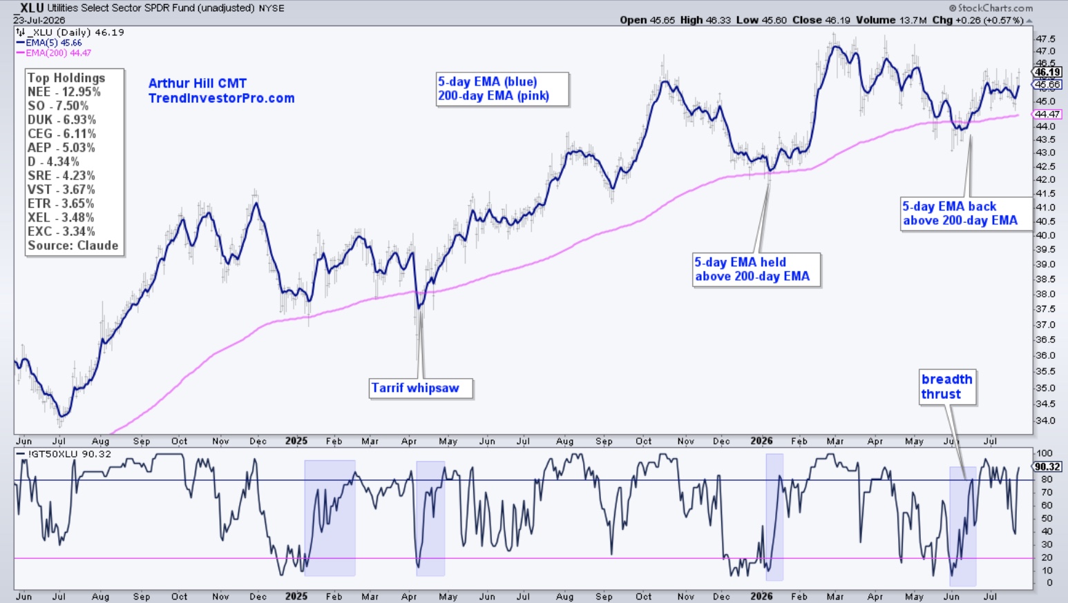
Roughly 90% of Utilities stocks are trading above their 200-day exponential moving averages, the highest reading of any sector.
Read the complete analysis from Arthur Hill.
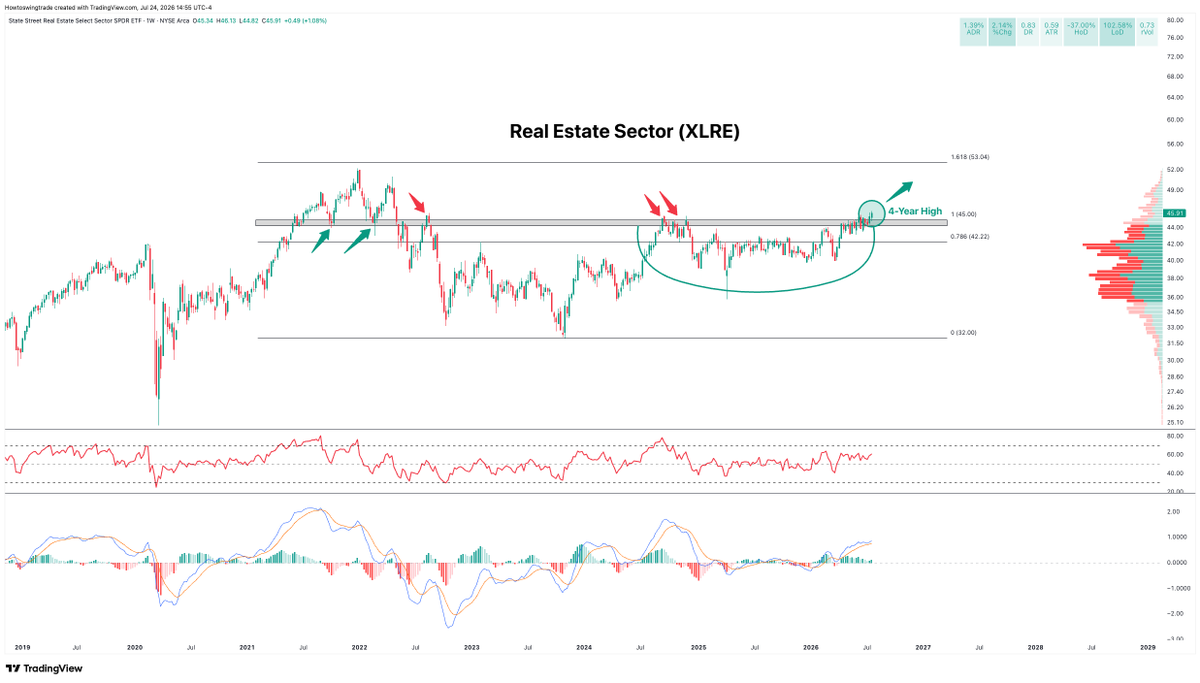
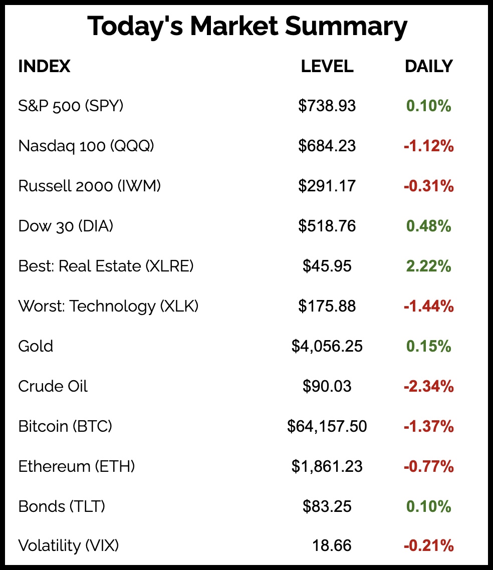
The Real Estate Sector ETF (XLRE) closed at new 4-year highs and was the best performing sector today.
Check out the entire tweet from CapitalFlows.
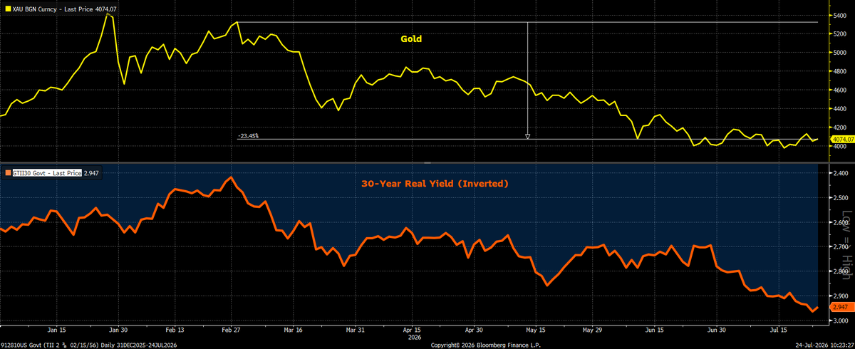
Gold has maintained a strong inverse correlation with the U.S. 30-Year Real Yield.
View the full post from Sonu Varghese.
The Chart Report curates best-in-class technical analysis from across the web.
If you’d like to share a chart or just say hello, email us at [email protected]