From Relative Lows to Relative Strength 📈 The Chart Report

Chart of the Day
🏆 Today's Chart of the Day was shared by Sentiment Trader.
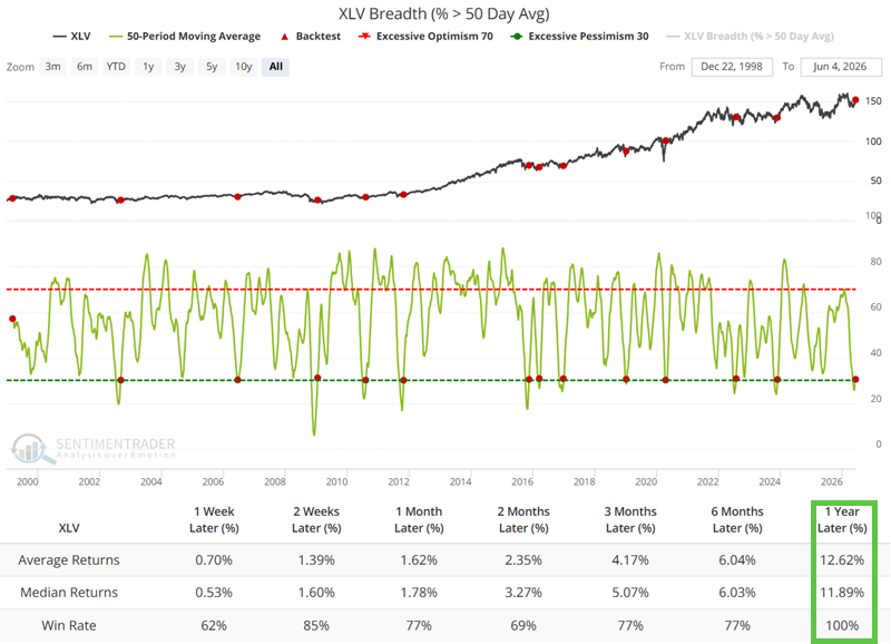
Health Care has been the top-performing sector over the past month, with over 30% of its stocks reclaiming their 50-day moving averages after its best five-day stretch versus the S&P 500 since 2009.
This type of breadth thrust has occurred just thirteen other times on record, and in every prior instance the sector was higher one year later, with a median gain of nearly 12%.
With Health Care still hovering near all-time lows relative to the S&P 500, the historical data suggests the sector may be in the early stages of a more meaningful rotation.
The Takeaway: The combination of improving breadth and historic underperformance creates a compelling setup for Health Care.
More Great Charts
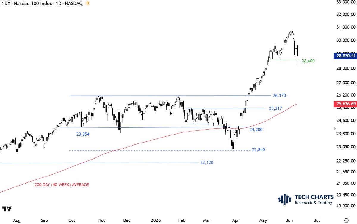
The Nasdaq had a quick sweep of its prior lows and managed to hold those levels.
See the whole tweet from Aksel Kibar.
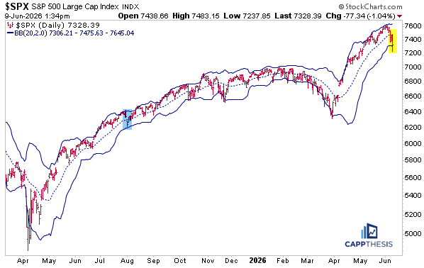
Today's move marked the first undercut of the lower Bollinger Band since the March lows.
Read the full analysis from Frank Cappelleri.
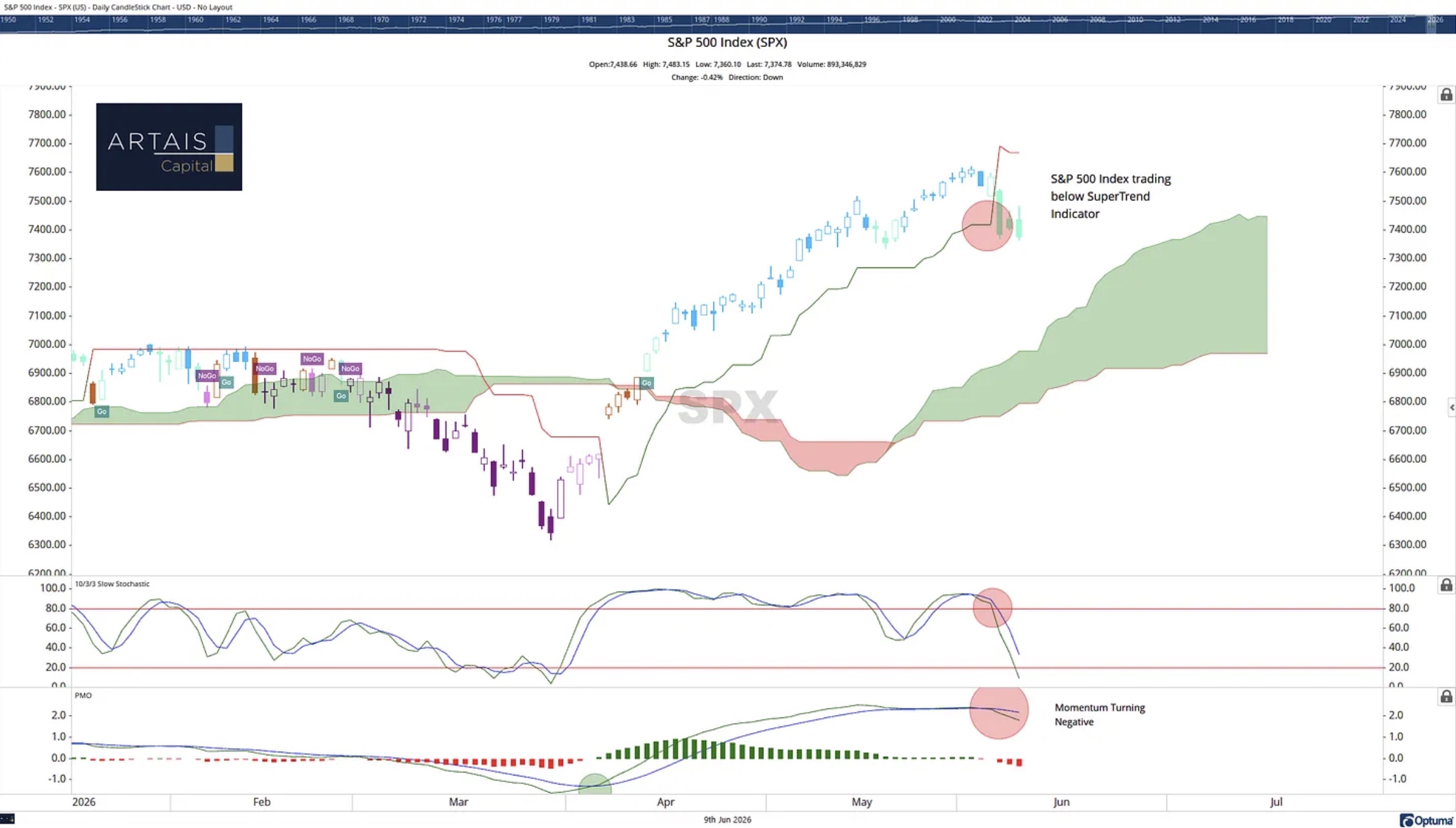
Trend and momentum gauges are rolling over simultaneously.
Explore the complete article from John Rothe.
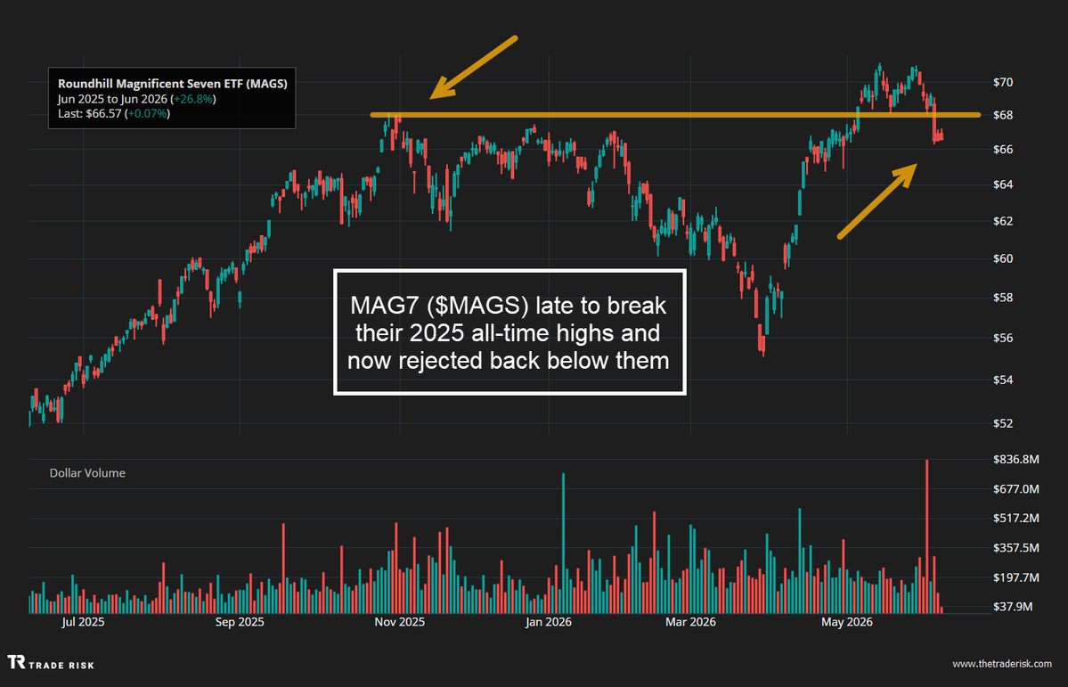
The MAG Seven ETF suffered a failed breakout at its October 2025 highs.
View the entire post from Evan Medeiros.
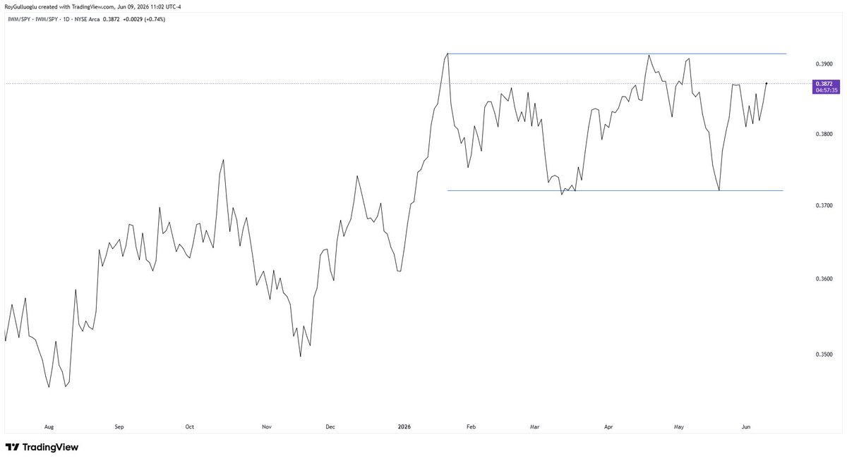
The Russell 2000 relative to the S&P 500 is in a constructive consolidation after its multi-month rally.
See the whole tweet from Roy Gulluoglu.
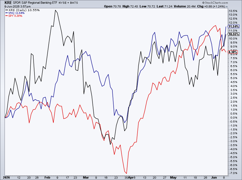
Regional Banks & REITs are both outperforming the S&P 500 year-to-date.
Examine the complete post from Mike Zaccardi.
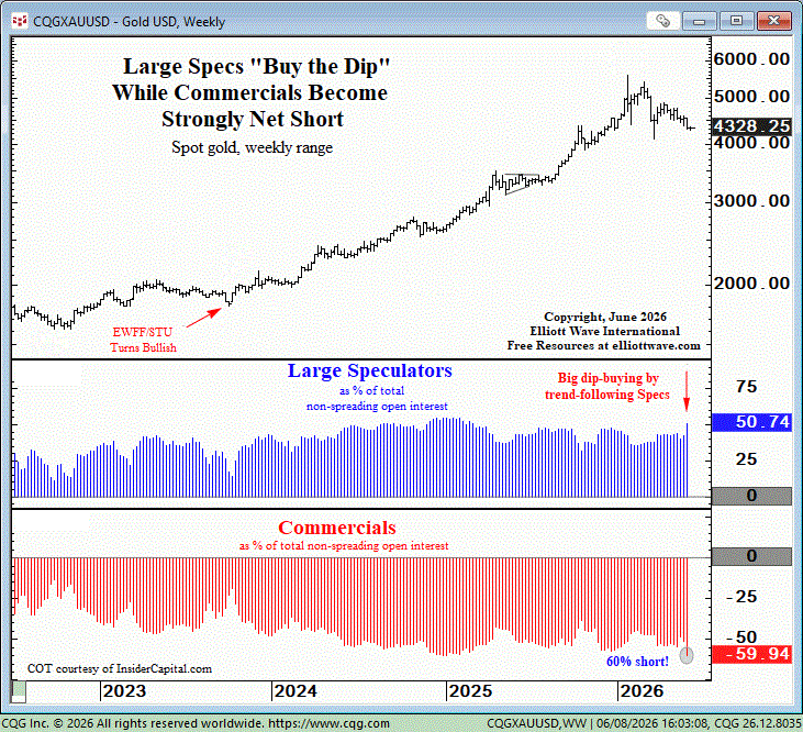
Large speculators have increased bullish exposure while commercial hedgers have built one of their largest net-short positions in over a decade in Gold.
View the entire tweet from Elliott Wave International.
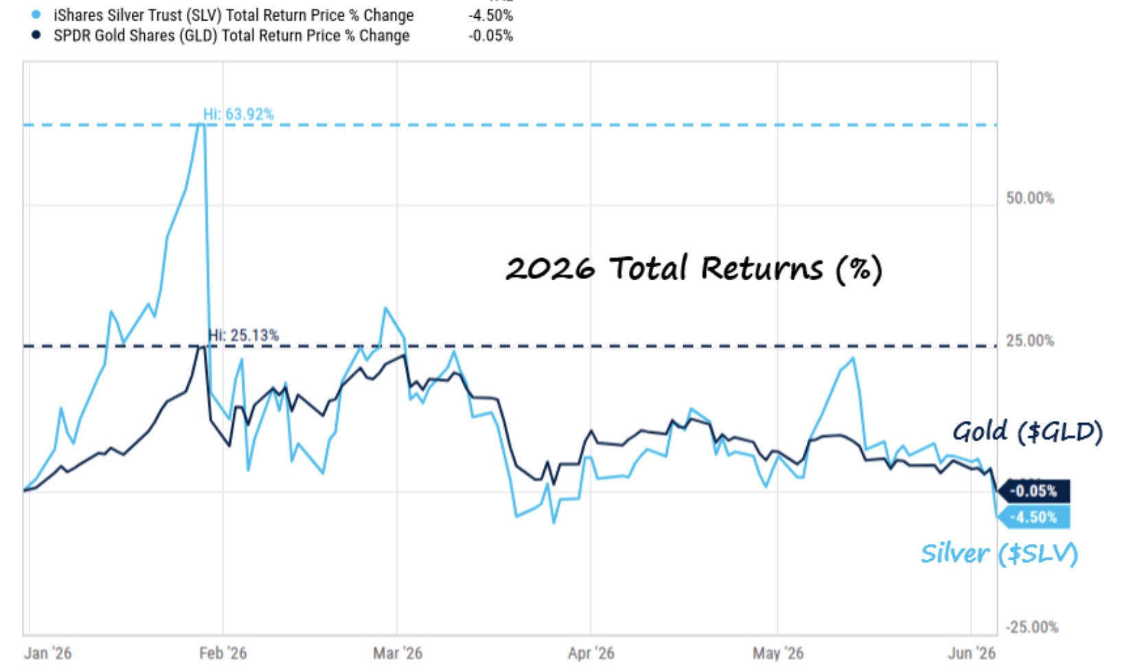
Precious metals have experienced a dramatic reversal, with both gold and silver moving from strong gains to negative returns on the year.
Check out the latest article from Charlie Bilello.
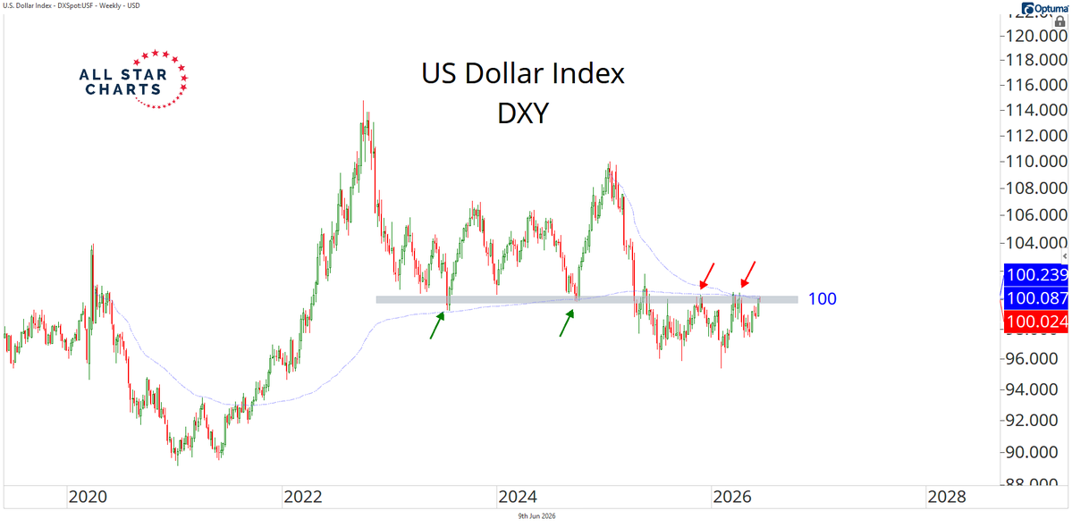
The U.S. Dollar Index is threatening to break higher from a key multi-year polarity level.
Read the full analysis from Alfonso De Pablos.
The Chart Report curates best-in-class technical analysis from across the web.
If you’d like to share a chart or just say hello, email us at [email protected]